Emotion Posters
Context: Project for HCDE 308 (Visual Communication in Human Centered Design and Engineering)
Duration: Two weeks
Collaboration: Individual
Tools: Adobe Illustrator
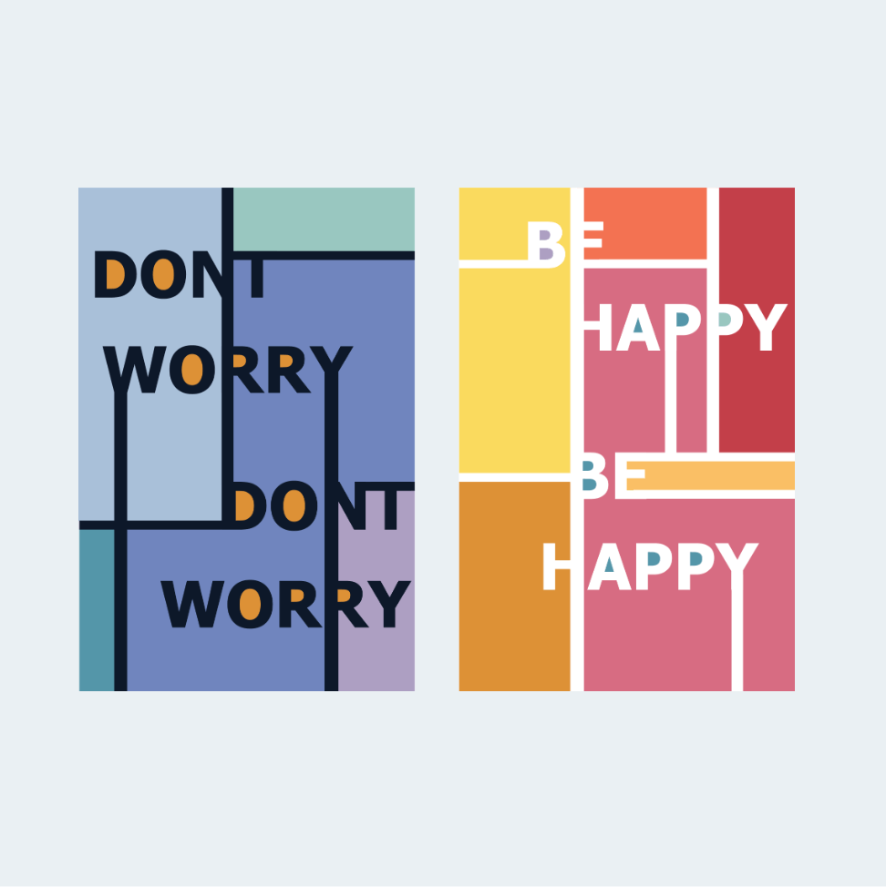
I was tasked with selecting a quote and creating two complementary posters that provoked emotion through color and typography. I applied my training in hues, shades, tints, and typography.
PROJECT DETAILS
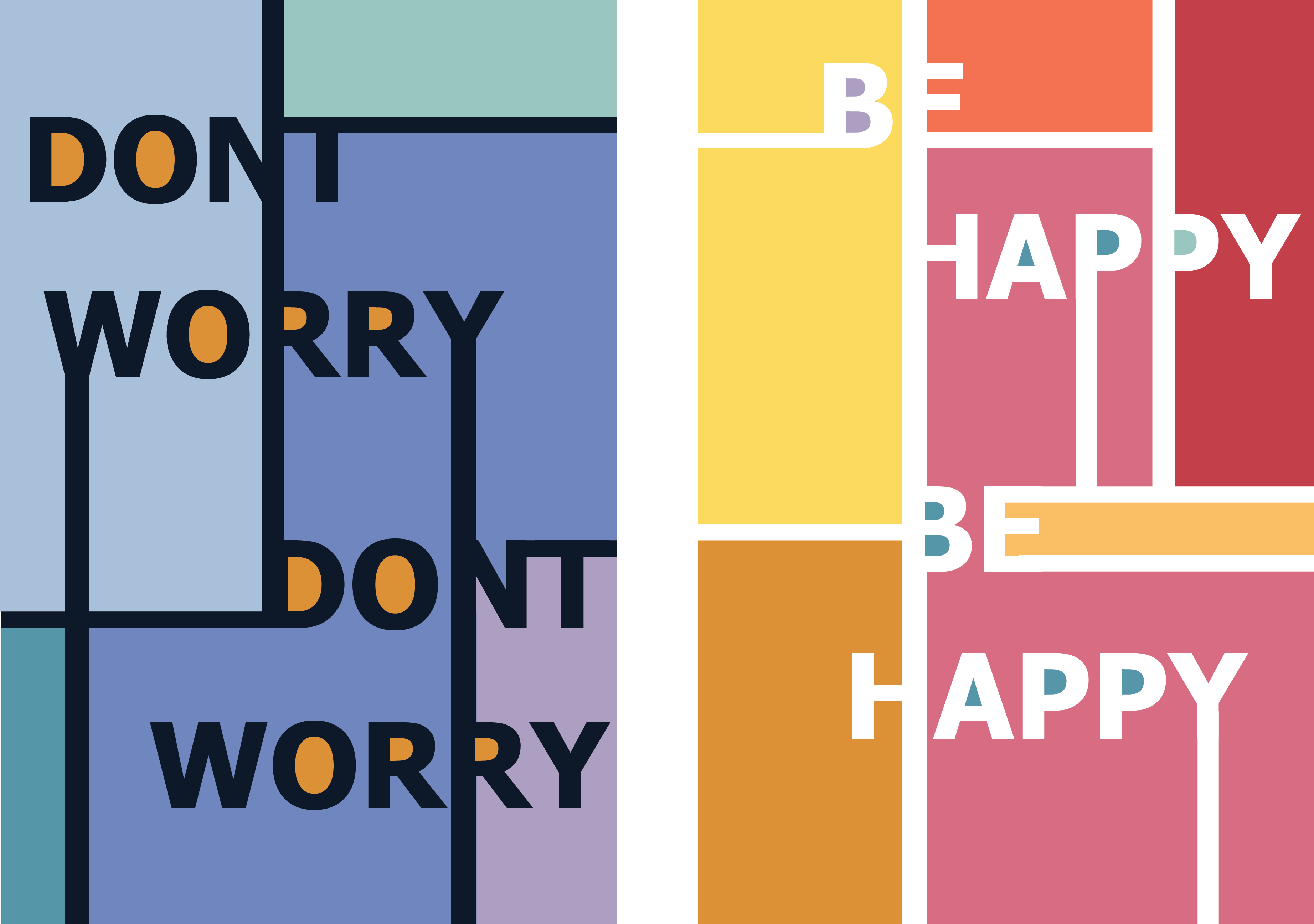
I chose the quote "Don't worry, be happy" from the song by Bob Marley. I split the quote into "Don't Worry" and "Be Happy" and wanted to evoke the emotions of serenity and joy.

For the "Don't Worry" poster, I conveyed the emotion of serenity through cool, analogous blue colors.

For the "Be Happy" poster, I conveyed the emotion of joy and excitement through warm, analogous colors.
I used complementary colors inside the fully enclosed space within each character, called the counter, to tie the two posters together. To foster consistency within the serenity poster, I strategically positioned the orange color in each letter's counter. For the joy poster I located multiple shades from the serenity poster and used those colors in the counters; this created a more energetic feeling.
TAKEAWAYS
Stretch the rules
Students were not allowed to use shapes within their poster; only typography and color were permitted. I gravitated towards the boldness of blocked colors. So, I explored how I could manipulate the letters to form block shapes. I overcame the design constraint by being creative with letter positioning and font choice.
