NightOwl
Work in progress
Work in progress
Context: HCDE 318 Introduction to User Centered Design
Duration: 11 weeks
Collaboration: Member of 4-person team
Tools: Figma, Adobe Illustrator, Adobe Photoshop
I followed the User Centered Design process from user research to high-fidelity mockups, over 11 weeks with my 4-student team. We selected college students walking alone at night, as a user group and problem area. Interviews were conducted, and user personas, journeys, and storyboards were created to help us understand our users and define the problem area. We sketched and created paper prototypes to use in usability testing that helped us refine our interface wireframes. This process culminated in an high fidelity prototype of NightOwl, an app students can use when walking alone at night to feel more confident and safe.
USER RESEARCH
The project began by conducting user interviews with UW college students who walk alone at night. Individual interviews were completed, followed by team synthesis of findings. My interview can be viewed here. Next, a “Fly on the Wall” observation was conducted in order to observe and investigate the behaviors of students walking alone at night. Finally, we performed a competitive analysis of existing apps that attempt to address student safety.
Key Research Findings
1. Walking alone at night is unavoidable because of studying and hanging out with friends
2. Students interact with their phones in some way while walking
3. Students often wear earbuds while walking
4. Calling a friend while walking makes them feel safer
5. An existing, UW Night Safety app is confusing to use
USER PERSONAS
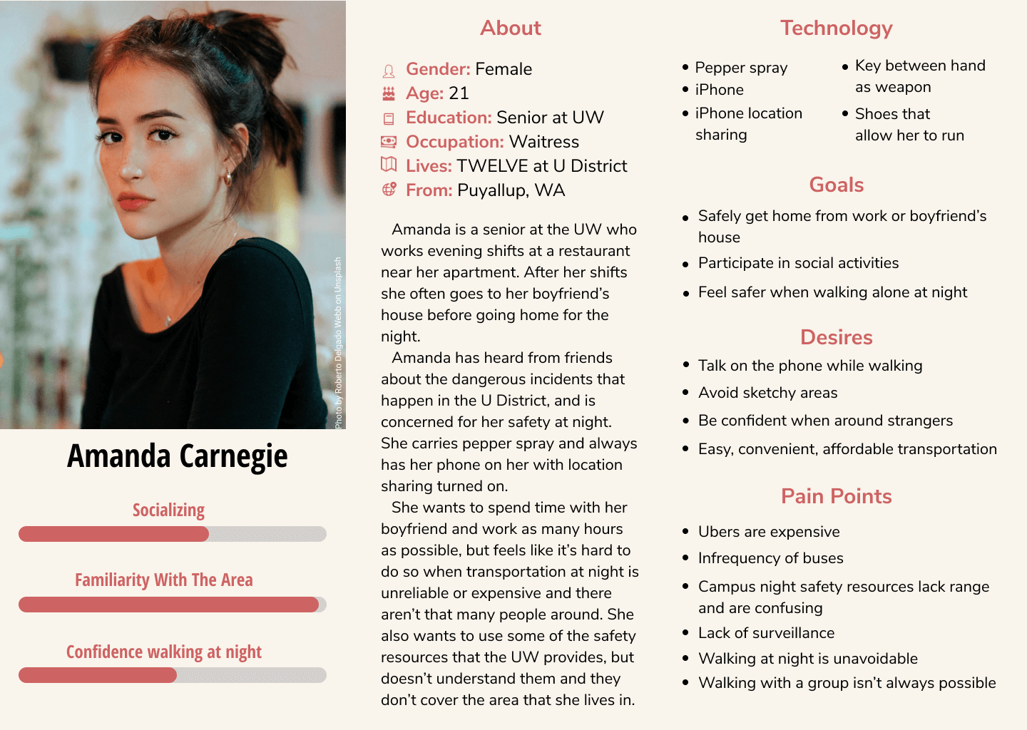
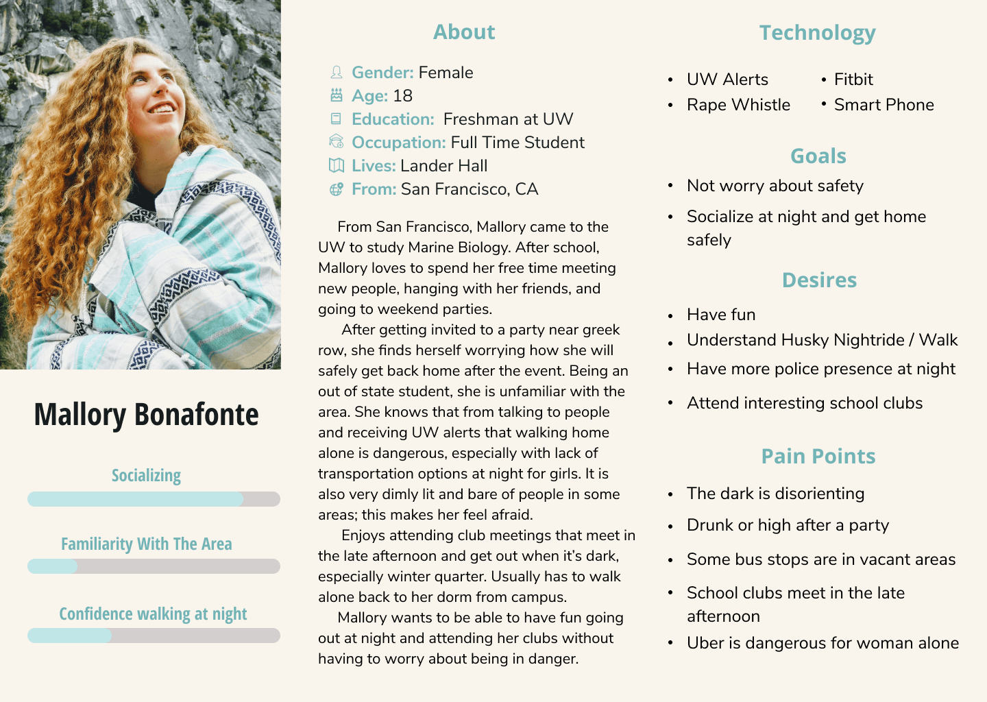
Based on our user research, we created two user personas to help us understand our users' needs, goals, and pain points. We frequently referenced them to realign our design to the users' needs.
USER JOURNEY
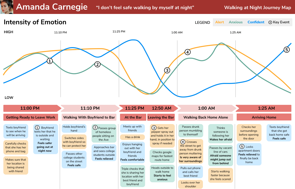
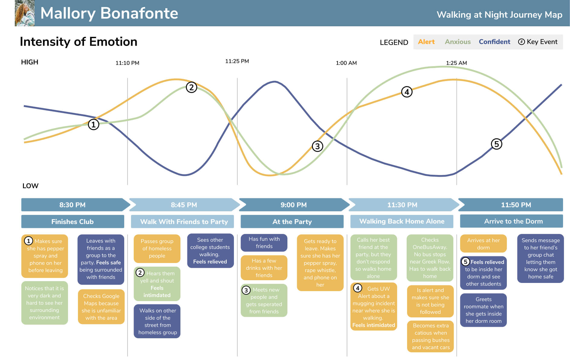
With our user persona Amanda as our inspiration, we created a user journey map to capture key touch points betwen her and her environment and emotions while walking at night. Specifically, we focused on anxiety, alertness, and confidence as the emotions we wanted to track, because they were the most prevalent emotions of our interviewees. This helped us emotionally empathize with our users and pinpoint times of anxiousness.
USER STORYBOARDS
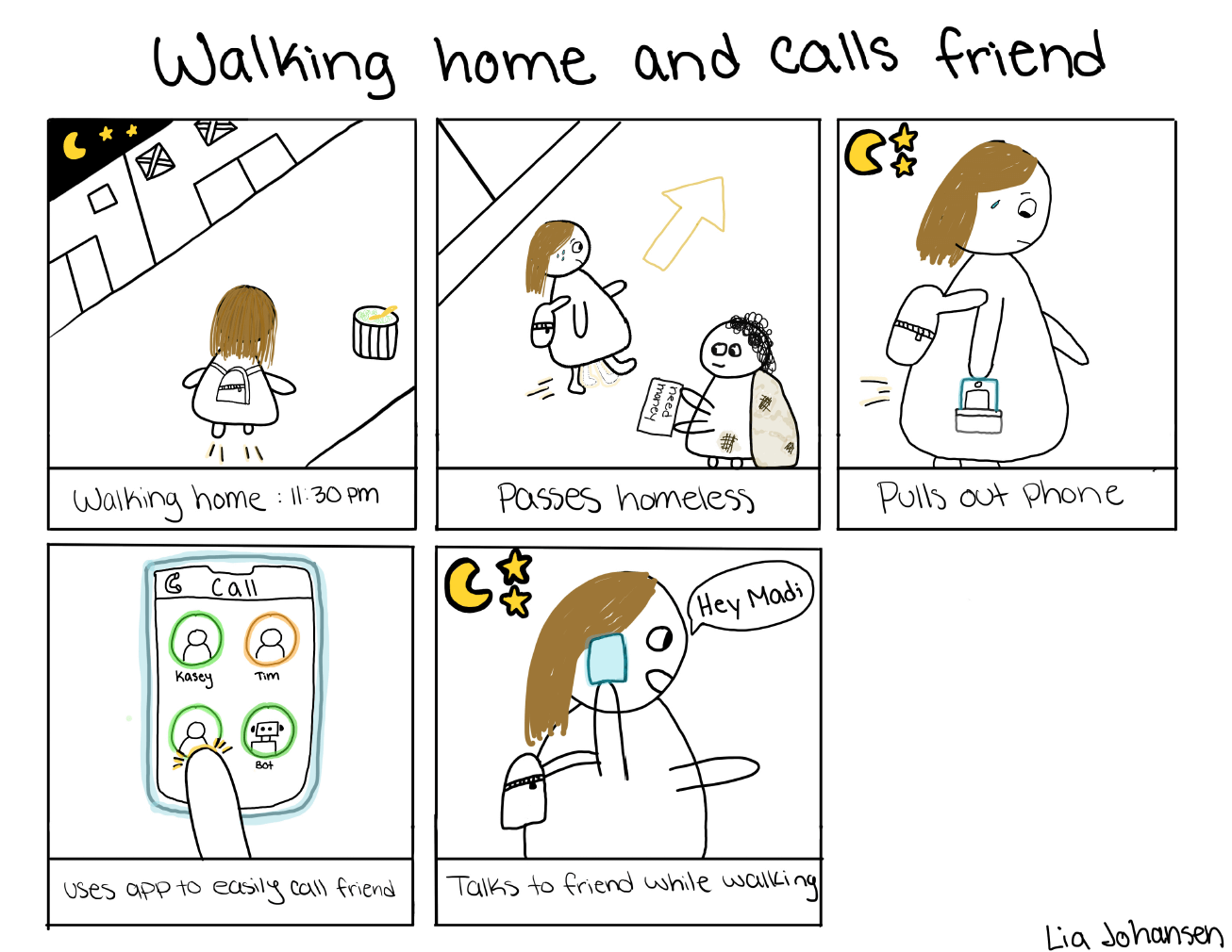
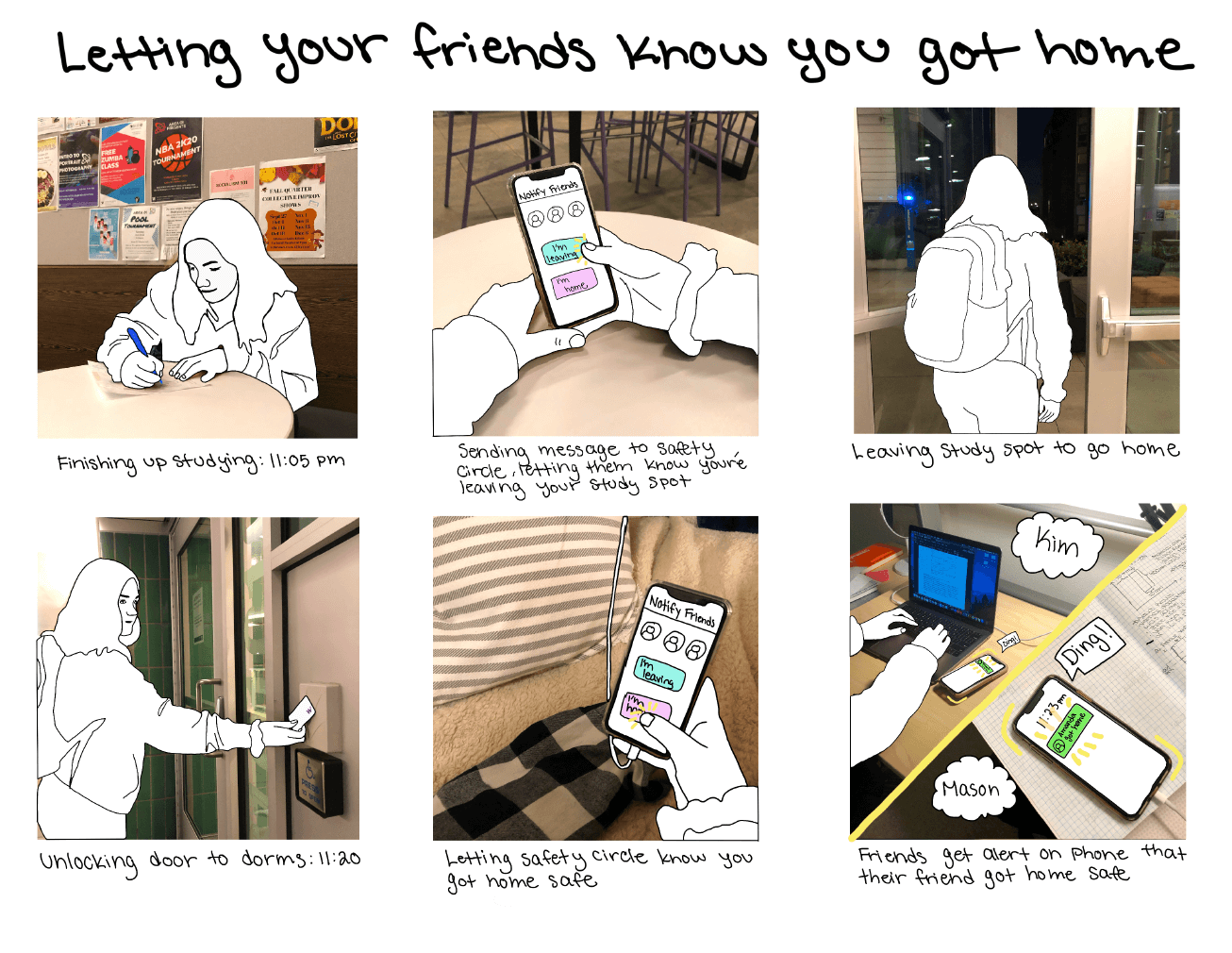
User storyboards helped describe specific situations in Amanda’s journey and provided important context for potential solutions. I focused on two features: Calling Friend feature that easily allows user to call a friend while walking and Alerting Friend feature that notifies a friend after the user arrives home. I created two storyboards; one hand drawn sketch and one hybrid photo sketch.
INFORMATION ARCHITECTURE
We decided to design an app as our product because based on observations, majority of users had their phone on them while they walked; this would make it easy for our users to user our product. Then, we started brainstorming key features that would be the most helpful to our users and solve their painpoints. The information architecture (IA) helped organize the structure of the features and their components. It also shows the navigational relationships between features. The IA helped us understand how each core feature worked in the larger picture of our solution.
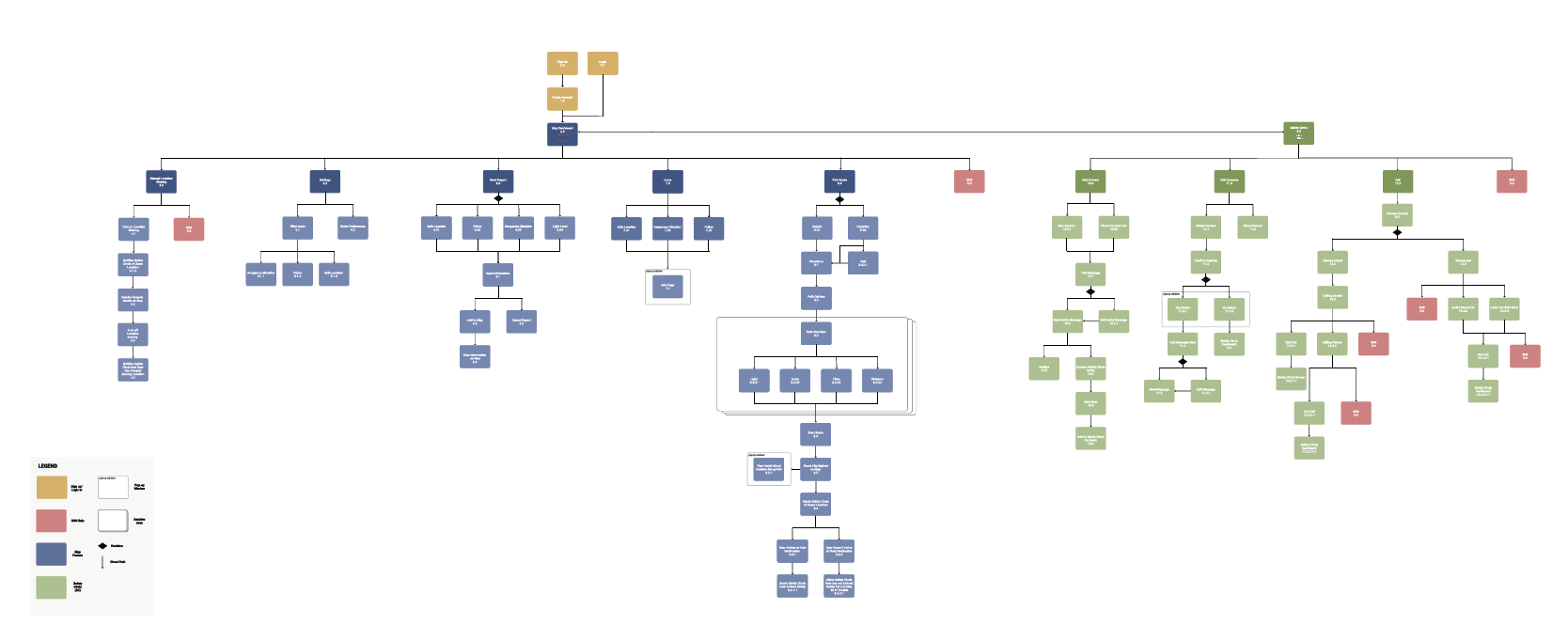
View close up of information architecture here
INTERFACE SKETCHES
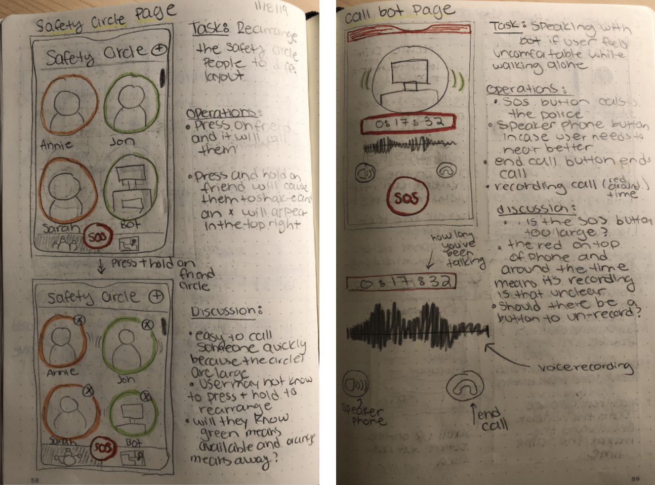
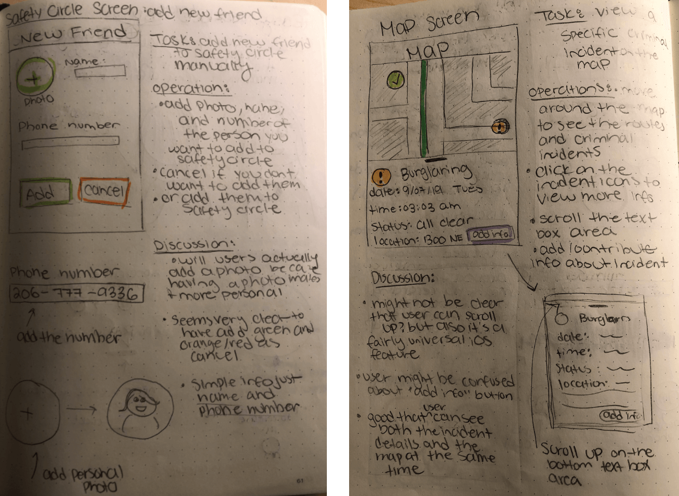
We each individually sketched and described three interfaces; these sketches would represent the most important aspects of our solution. For my sketches, I focused on the safety circle with the calling feature. I thought this was a key feature, because users stated they feel comfortable talking to someone when walking alone. After ideating and sketching alone, we came back together and combined our rough draft sketches into consistent interface sketches for our paper prototypes that we used in our usability tests.
PAPER PROTOTYPES & USABILITY TESTING
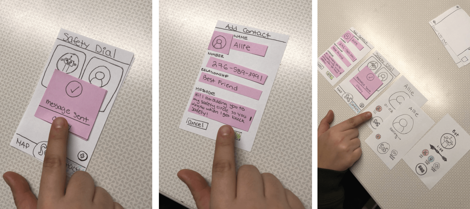
The paper prototypes were a quick, easy way to test the designed features without
distracting users with colors. They helped us pinpoint confusing and unintuitive functions of our initial features,
which we incorporated into our redesign. Based on our storyboards and information architecture diagram,
we defined three key tasks that we asked users to complete in our tests.
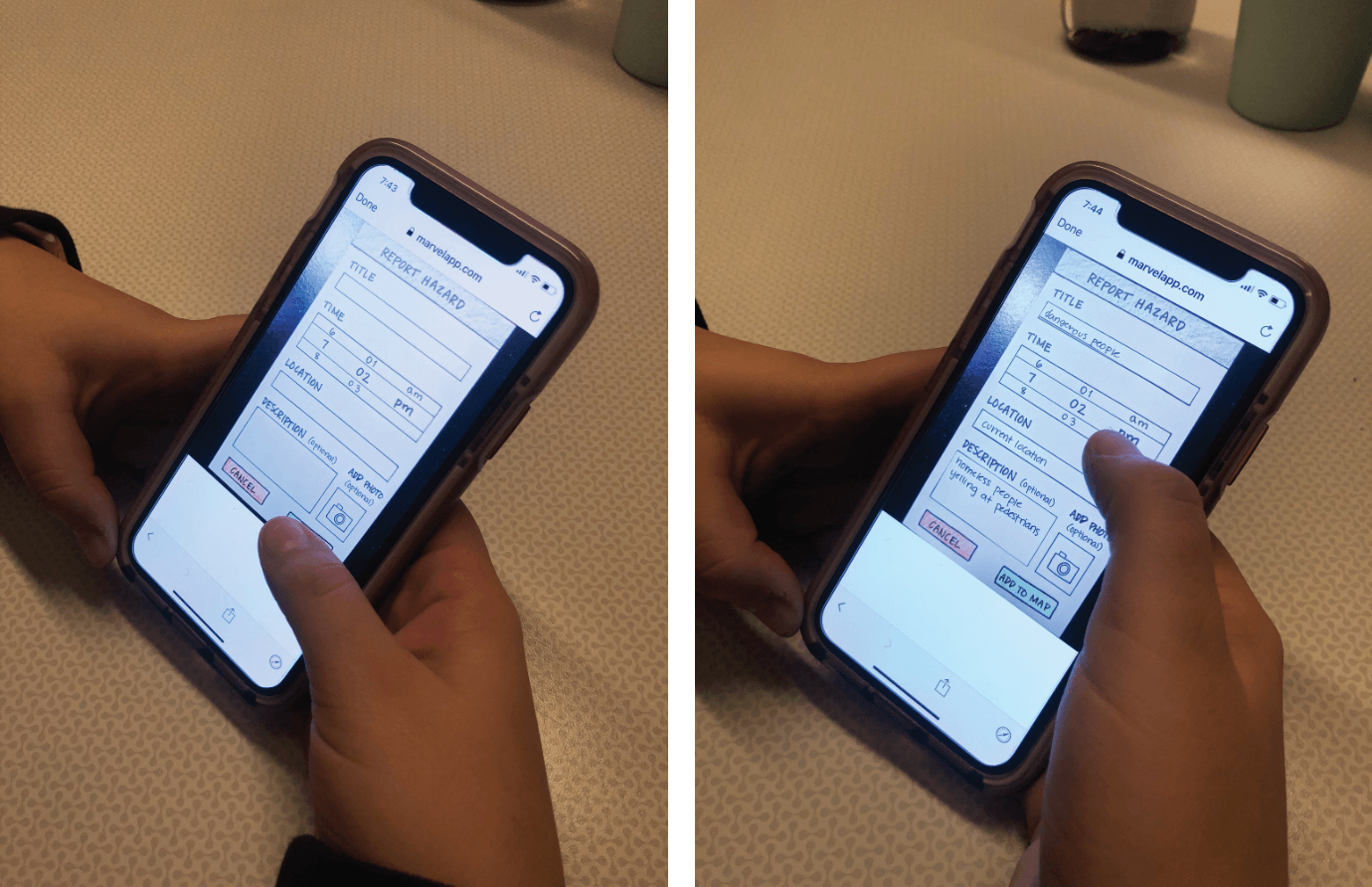
I conducted usability testing with two UW students. During the test, I asked users to complete three key tasks.
Two tasks tested the map feature and one task tested the Safety Contacts feature. After the team performed our usability tests,
we regrouped to compile and analyze our results; our findings helped us improve our next design iteration.
REFINEMENT
Based on our findings from our usability tests we made three major changes to our designs.
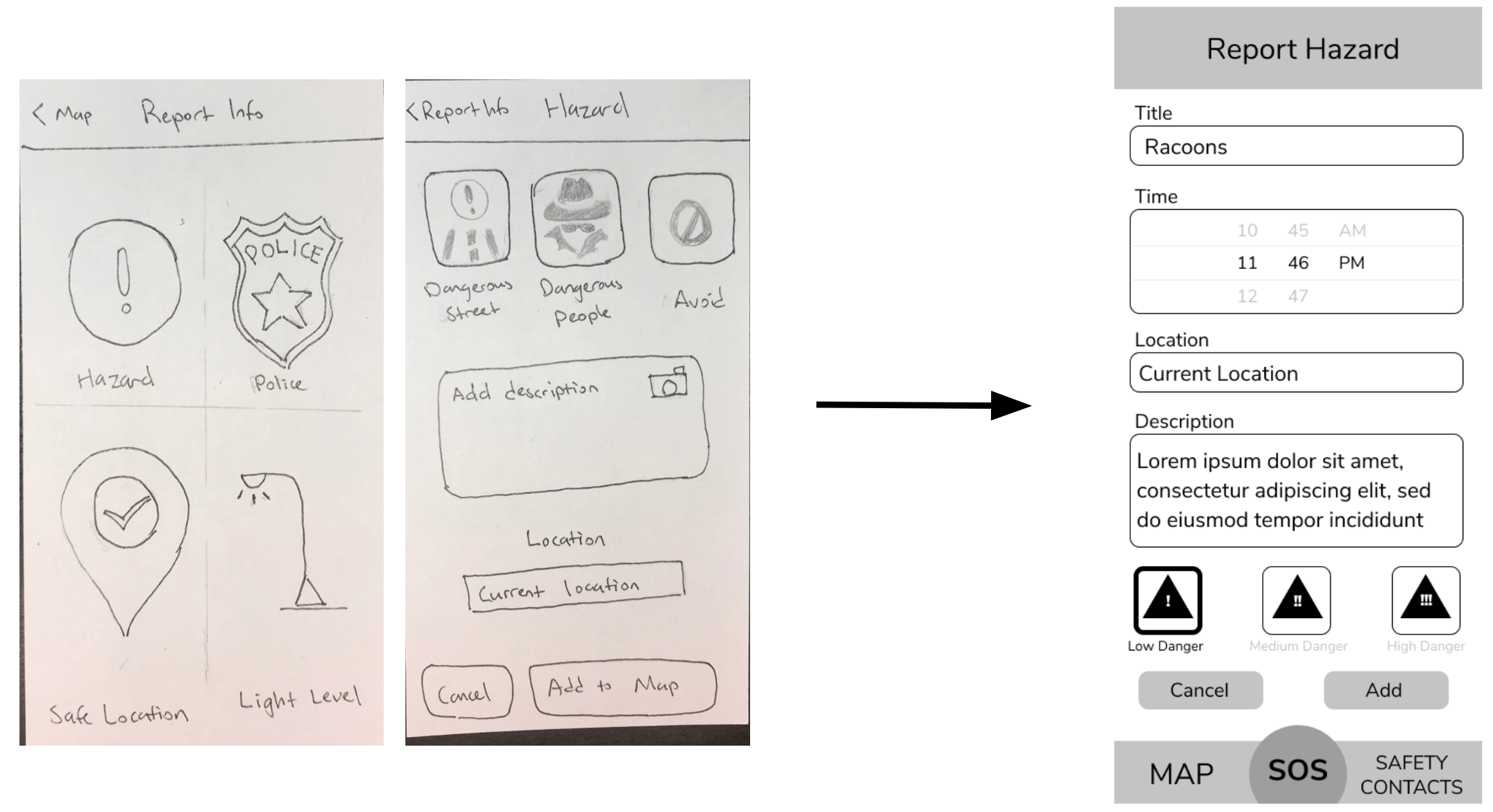
Report Hazard Screens
The different icon categories and hazard types were confusing, but users still wanted hazards to be differentiated. For example, one user stated that broken glass would be a different hazard level than a stabbing. We incorporated the feedback by making the report hazard feature one screen to make it easier, removed the hazard categories and types and made it into an input title box, and added hazard levels (low, medium, high danger).
Calling Safety Contact Screen
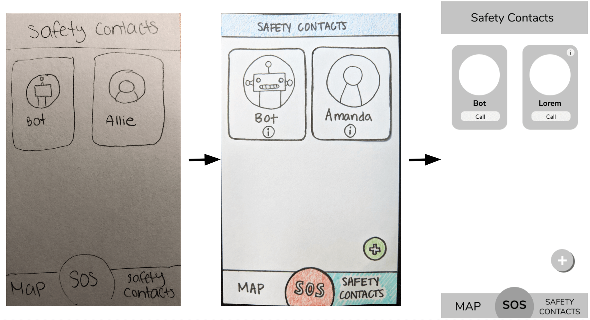
When users tapped on a contact, they expected to be taken to an editing page where they could call their contact, instead of immediately calling them. We incorporated the feedback by adding a 'call' and information i button on the contact so that users know that by tapping the call button, it would immediately call their contact.
Select Route Screen
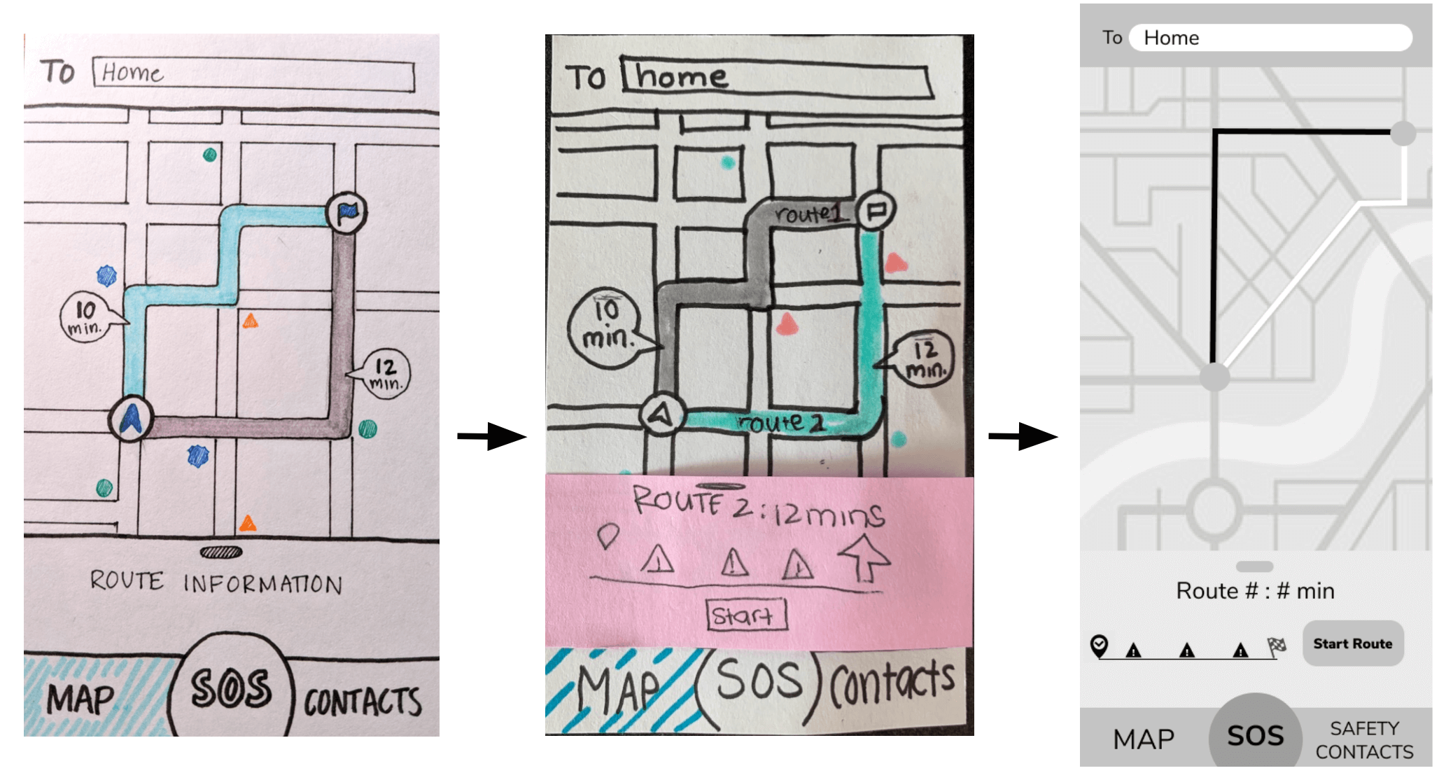
Users were confused with how to start their route after selecting a preferred route; it was unintuitive to scroll up on the bottom bar. Users were also concerned that they would accidently tap the SOS button when trying to start their route. To alleviate the confusion, we added the 'start route' button to the collapsed menu and moved the button to the right side.
ANNOTATED WIREFRAMES
Based on our usability testing feedback we redesigned the wireframes, and used our IA to create the app's full functionality in Figma. These wireframes are low fidelity (no color or real text) to focus on communicating the app's functionalities. The annotations highlight key components. These wireframes were the foundation when transitioning to design the high fidelity prototypes.
HI FIDELITY PROTOTYPE
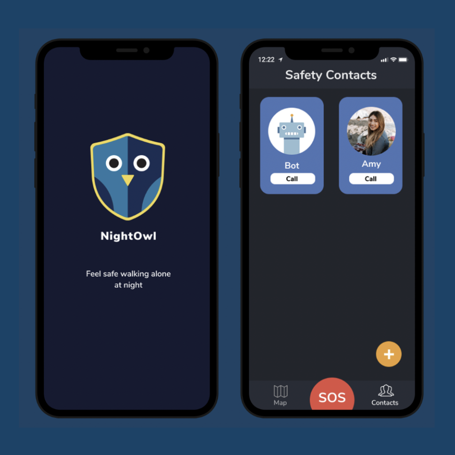
Based on all our research and testing, we created an app called NightOwl that students can use to feel safe and confident when walking alone at night. The app has two main components: Safety Contacts and Map.
Students walking alone at night can use this app to find the safest path to their destination, call their friends, and report and upadate current incidents and hazards. All of these elements combined contribute to feeling safe at night.
For the color scheme, we chose dark mode because users would be using this app at night, so we wanted the screen to be subdued. The color scheme is dark blue, bright orange, and bright red. It was important to create high contrast to show key information. Orange represents important actionable items such as reporting a hazard and starting route. The bright red is used only for the SOS button to ensure it stands out in case of emergency.
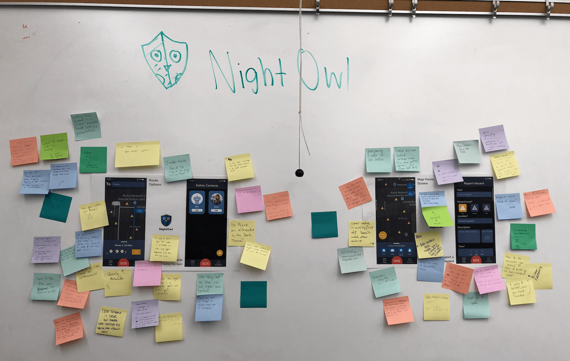
We had one final in-class critique to iron out any final design inconsistencies, colors, and confusing action items. We took our final feedback and created our final high fidelity wireframes.
REFLECTION
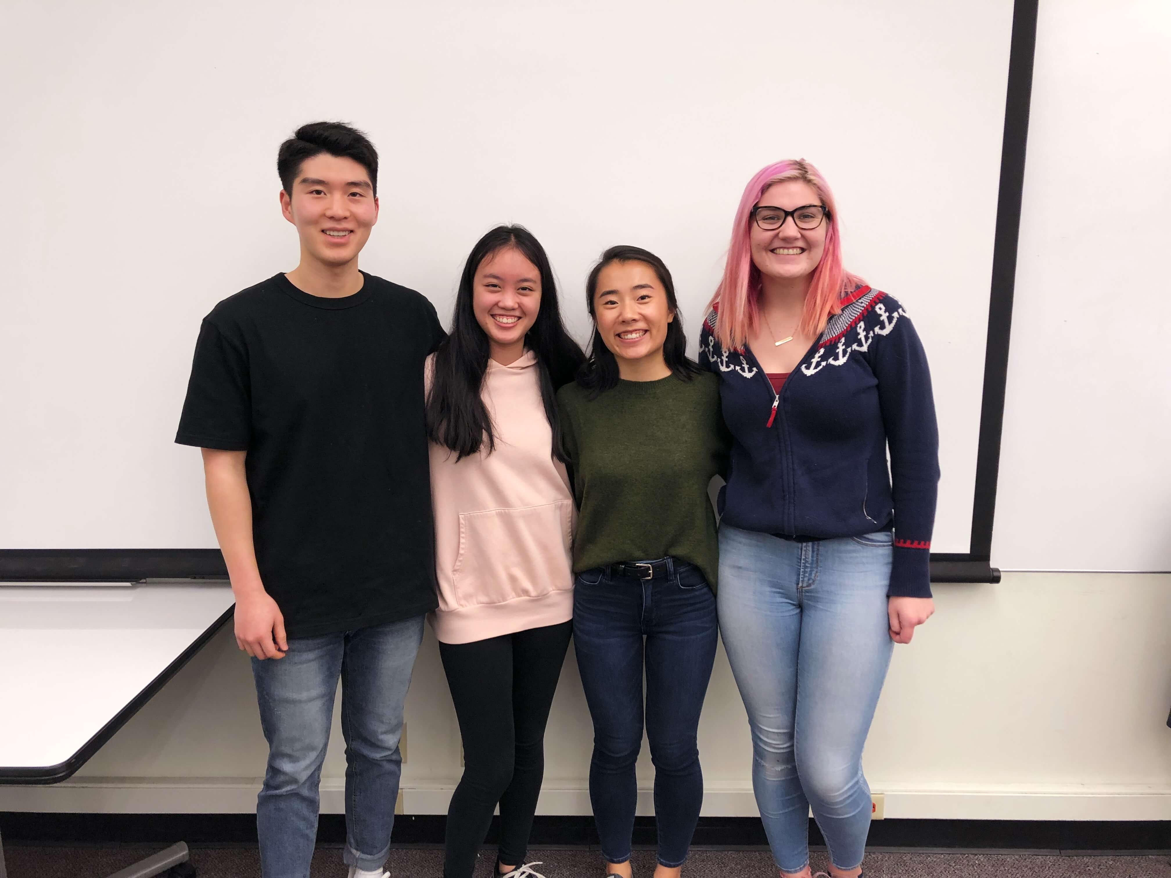
This class was challenging but rewarding. I had previous experience with the UCD process, but not to this depth. I enjoyed diving into each main part (research, ideation, design/refinement) and see the direct connections between deliverables and how the process culminated into a successful solution. Throughout the whole project, Slack was our best friend to maintain clear, effective communication. This project reinforced my passion for UX design and working on teams to design solutions that solve real user problems. Overall, I grew both as a team member and as a UX designer.
A solution and design is never perfect and can always be improved and refined. Reflecting back to our solution and design process, I always think that more user research and competitive analysis is helpful. Because of time constraints we only interviewed four users. I would have liked to interview more students who lived off campus to get their perspectives on their walking experiences. Also, it would have been useful to do competitive analysis on other safety technologies and services outside of mobile apps. Furthermore, I would like to do more usability testing on the SOS button and Bot calling feature. Some users stated that they would not use the bot feature while others though they would during dangerous situations. In the future, it would be important to better understand users intentions with the calling feature in order to create a useful bot feature.
Finally, at our final presentation we got the thought provoking question on how to optimize our map for users going on the same route to the same final destination. If I were to do the project again, I would keep this in mind especially during user interviews. Another aspect to consider is how our solution can keep our users attentive and alert while still promoting using our app.
TAKEAWAYS
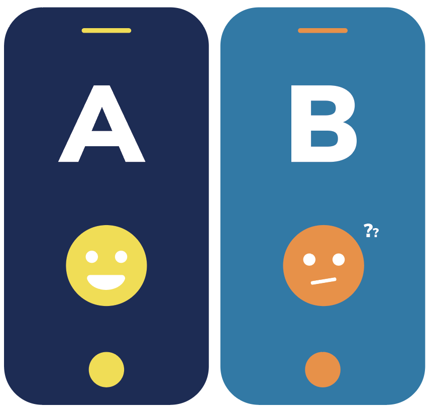
When in doubt, ask your users
There were many occasions where my team and I had differing opinions on designs. Specifically with the SOS button. I learned that when in doubt (or disagreement), test with your users! As a designer, you are designing the solution for your user group. So, it's pertinant to get constant feedback on the designs and functionality to ensure you are tailoring your solution to the user.
Optimize team's strengths
Each team member brings a different perspective and talent to the group. I learned how to optimize efficiency and create quality work by undersatnding and using each member's skills and passions. At different steps in the UCD process, each one of us went above and beyond to help the project excel.
